Brochures and Flyers
The design of a brochure must be appropriate to the topic concerned, it must secure the attention of the target group(s) and encourage them to absorb and assimilate the brochure’s content and messages. Flyers can be used specifically to communicate information on particular, current topics and events. As such, the requirements relating to the design of flyers and brochures are as diverse as their contents and target groups. They are always instrumental in projecting a positive imageImage
The publicly perceived image of a company, brand, product or service. Determined primarily by ... for the subsidiaries bearing Daimler as part of their company name, however, and position the subsidiaries concerned in the public domain. As target groups and the scope of topics covered by a brochure or flyer are highly diverse, they must always be designed along recognizable lines. The corresponding high-quality printing defines the stylish appearance, which reflects superiority.
 Design of Front and Back Covers
Brochures and flyers from Daimler name-bearing subsidiaries are always produced in A6 to A4 portrait format. Flyers are produced in DIN lang (DL) format and in 100 x 210 mm format.
Sizing the Daimler Logotype and Positioning the Subsidiary Name
The Daimler logotype is always positioned at the top left on the silver raising area on the front and back covers of brochures and flyers. It is either embossed by means of hot-foil stampingFoil Stamping
Finishing process during which a tinted foil is applied to a printing substrate with a heat ... in conjunction with the raising area in the special color PantonePantone
The Pantone matching system (PMS) consists of spot colors (“special colors”) from Pantone LLC. 10077 or printed in 4C. The size of the logotype depends on the format of the brochure or flyer, as does the width of the subsidiary’s company name.
Applying the Raising Principle and Brushing
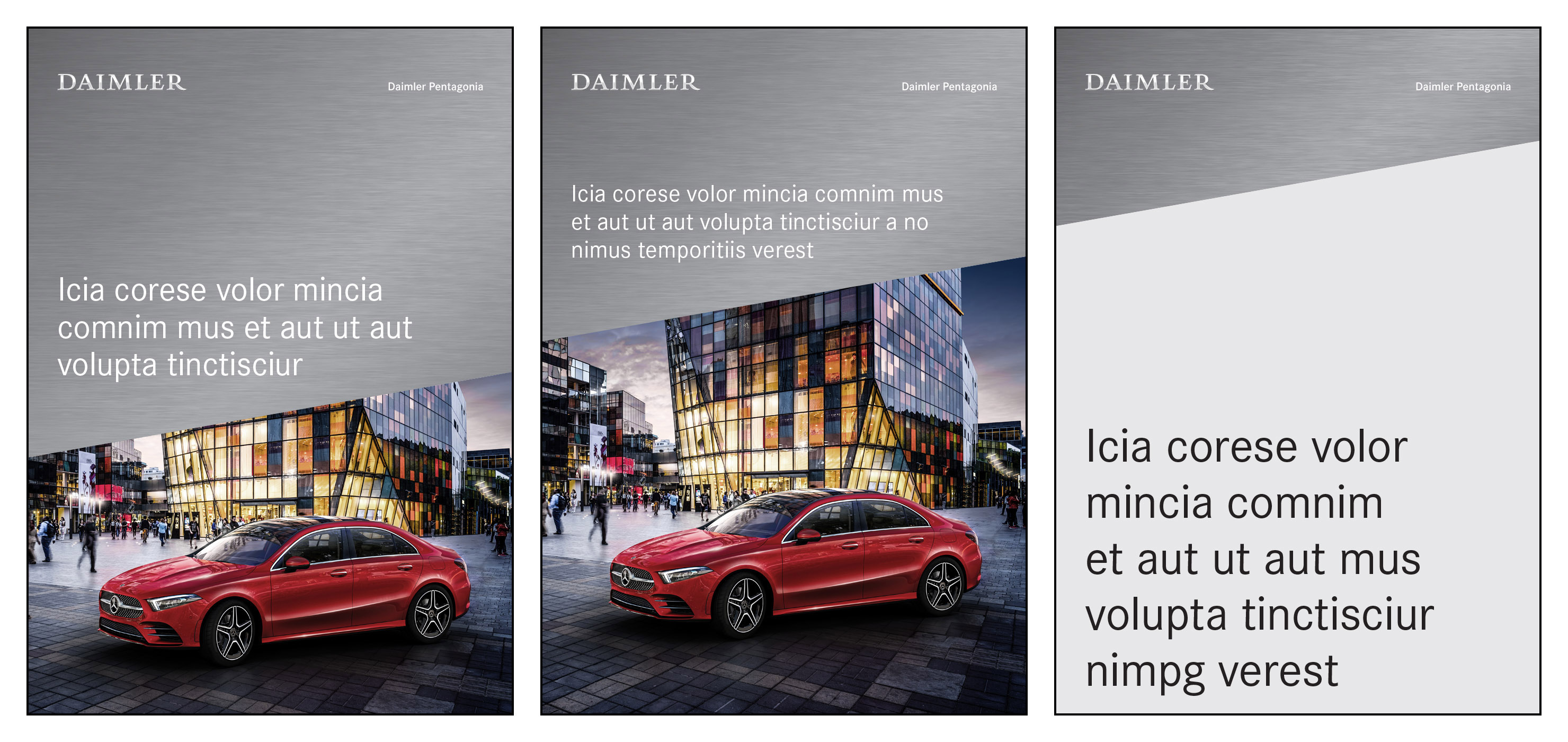
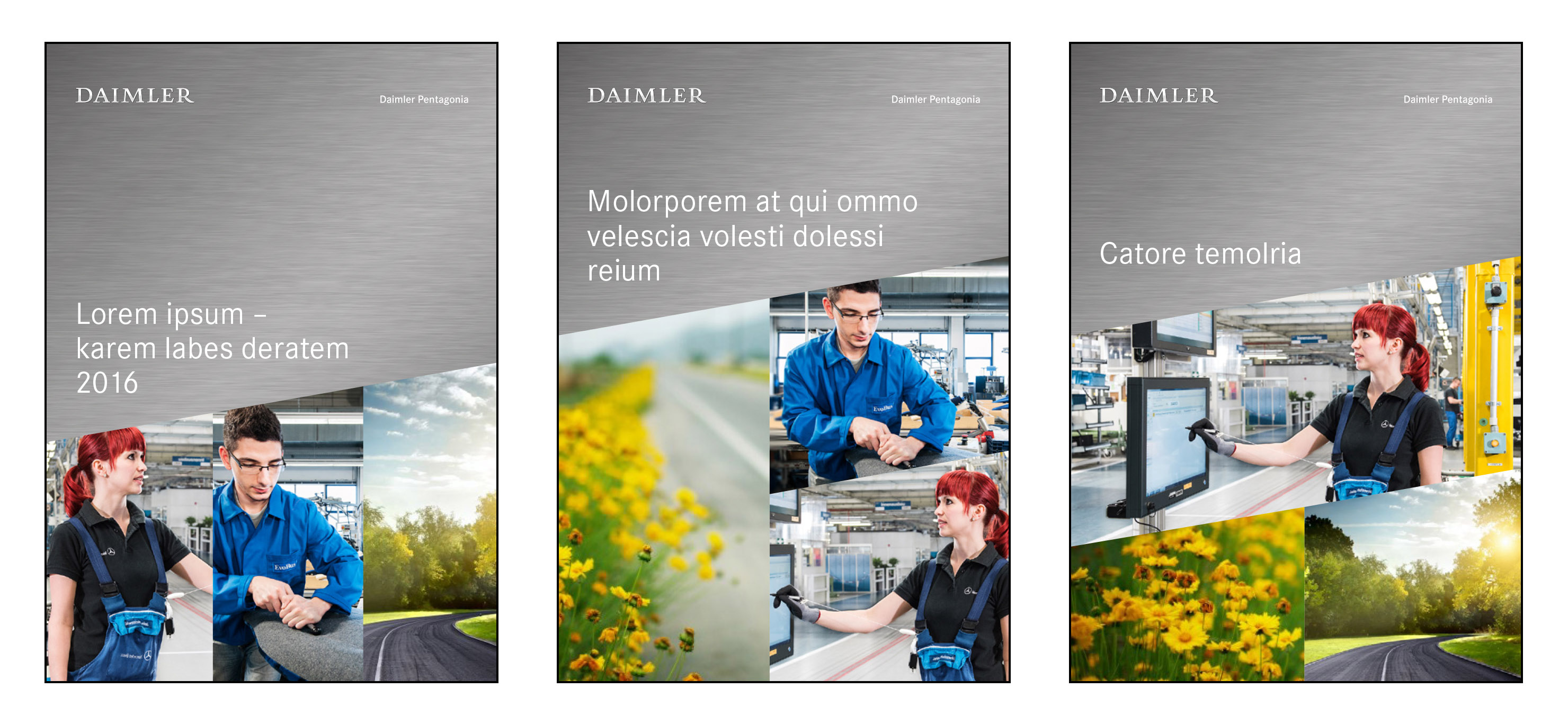
The silver raising area is obligatory on the front covers of brochures or flyers and is always positioned at the top of the page. On front covers it is combined either with images or with a Light Grey area. In the case of the front cover combination of raising area and image, the headline is positioned on the silver raising area. By way of exception, it is also possible to integrate the title of the brochure in the image. In the case of the combination of silver raising area and Light Grey area, the headline appears on the Light Grey area. The headline is always structured from the bottom to the top. When the headline appears on the raising area, it must be ensured that the minimum distances from the Daimler logotype and from the slanting edge of the raising area are observed.
The Daimler logotype and the subsidiary name are always positioned at the top left on the silver raising area on front covers of brochures. Three different heights of raising areas are possible on front covers.
Headlines
Headlines always appear in Daimler CS Regular without punctuation at the end, and using letters in mixed case. There are four defined type sizes for each format:
| Headline |
A |
B |
C |
D |
| DIN A4 |
30 pt/12 mm |
42 pt/16 mm |
60 pt/24 mm |
84 pt/32 mm |
| DIN A5 |
24 pt/10 mm |
36 pt/14 mm |
48 pt/18 mm |
60 pt/24 mm |
| DIN A6 |
18 pt/8 mm |
24 pt/10 mm |
30 pt/12 mm |
36 pt/14 mm |
| DIN lang (DL) |
18 pt/8 mm |
24 pt/10 mm |
30 pt/12 mm |
36 pt/14 mm |
| 100 x 210 mm |
18 pt/8 mm |
24 pt/10 mm |
30 pt/12 mm |
36 pt/14 mm |
Headlines on brochures can appear in various sizes. The minimum distance from the slanting edge of the raising area and from the Daimler logotype must always be observed, however.
By way of exception, it is also possible for the headline of a brochure to be integrated in the image.
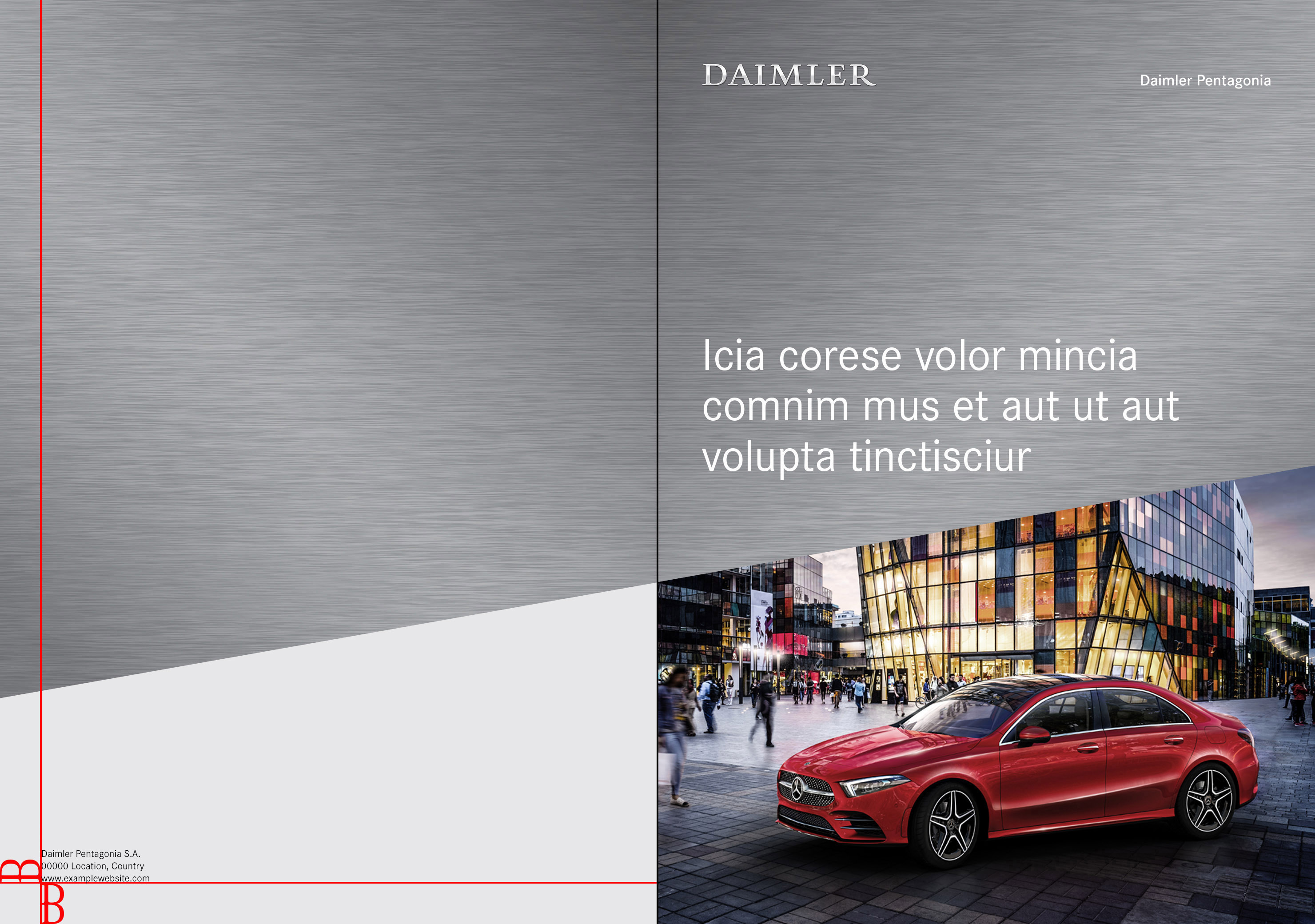
The raising area on the front cover is continued over the spine to the back cover. On the back cover, the silver raising area can be combined with a colored area in Light Grey or the continuation of the image from the front cover. The publisher’s information generally appears on its own at bottom left. When large amounts of information are involved, the back cover of a flyer can, in exceptional cases, be filled with content. In these cases, the raising area does not continue onto the back cover. Lettering on the spine is rotated and justified with the top edge of the Daimler logotype.
The raising area on the front cover is always continued onto the back cover of the brochure and combined with the overflowing image or a Light Grey area.
When large amounts of information are involved, the back cover of a flyer can be filled with content.
LayoutLayout
The layout provides the designer and requesting party with an impression of how a communication ... of Inside Pages
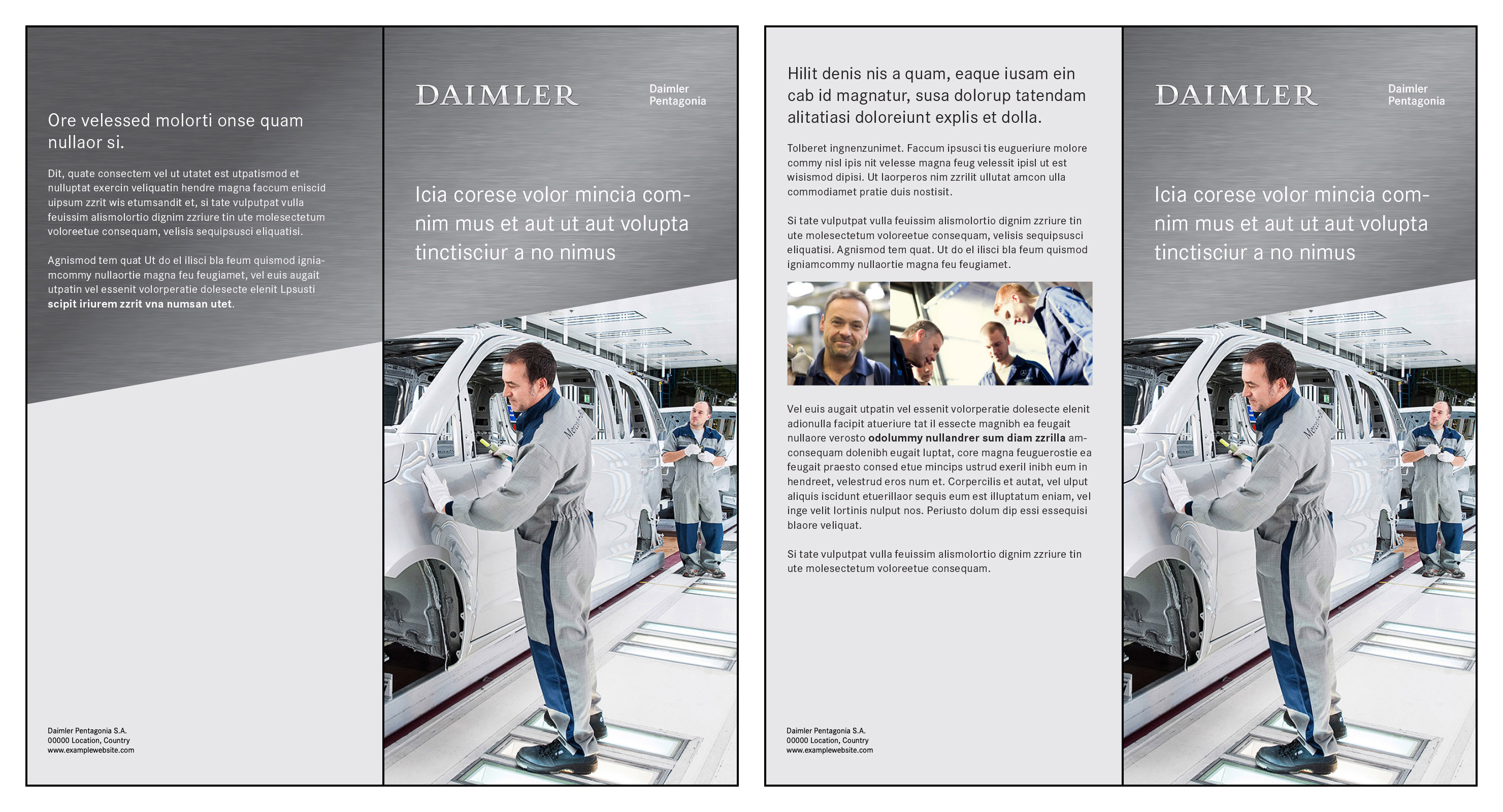
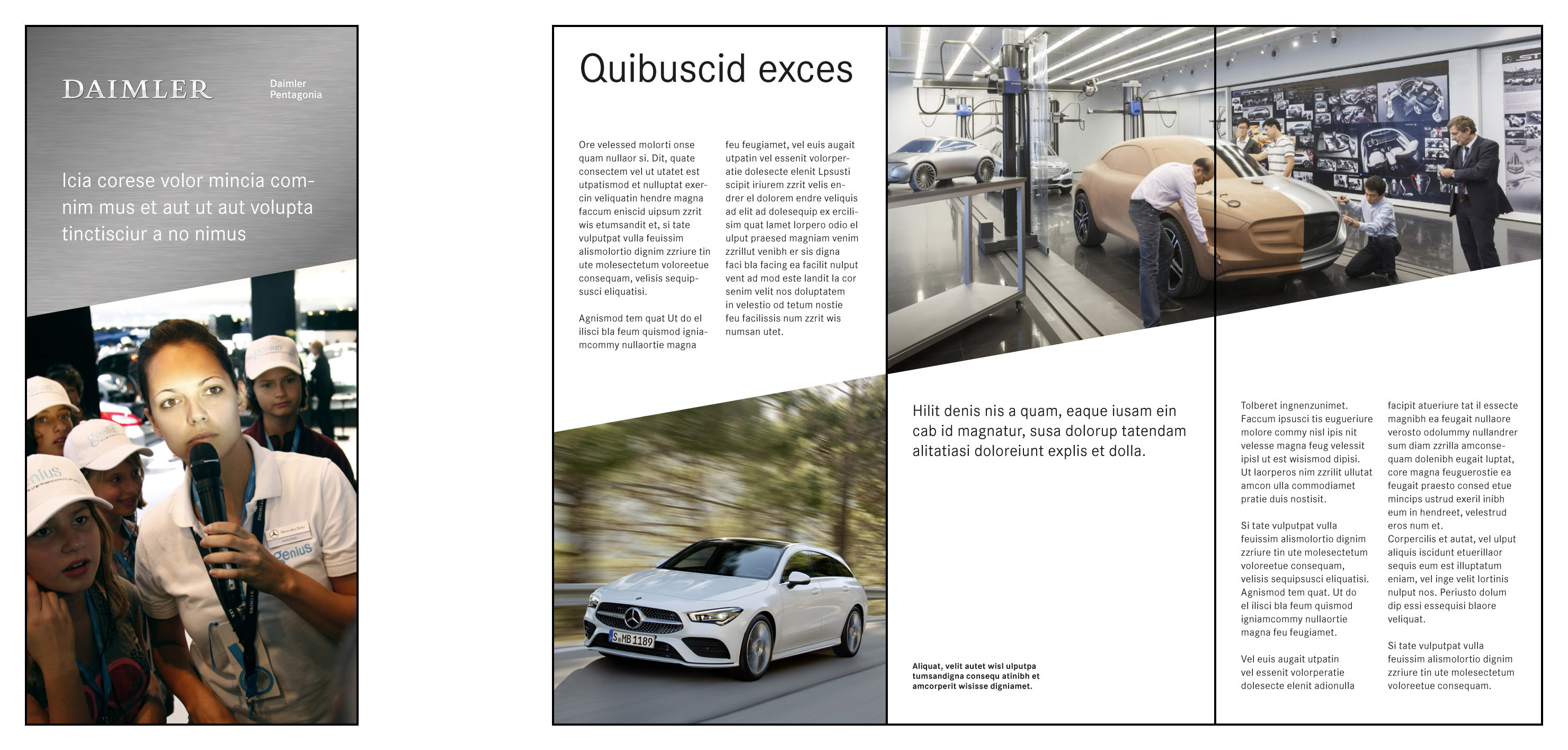
While front covers present the sender and the topic, inside pages serve to present various content in a comprehensible and appealing manner while retaining the rhythm of the layout.

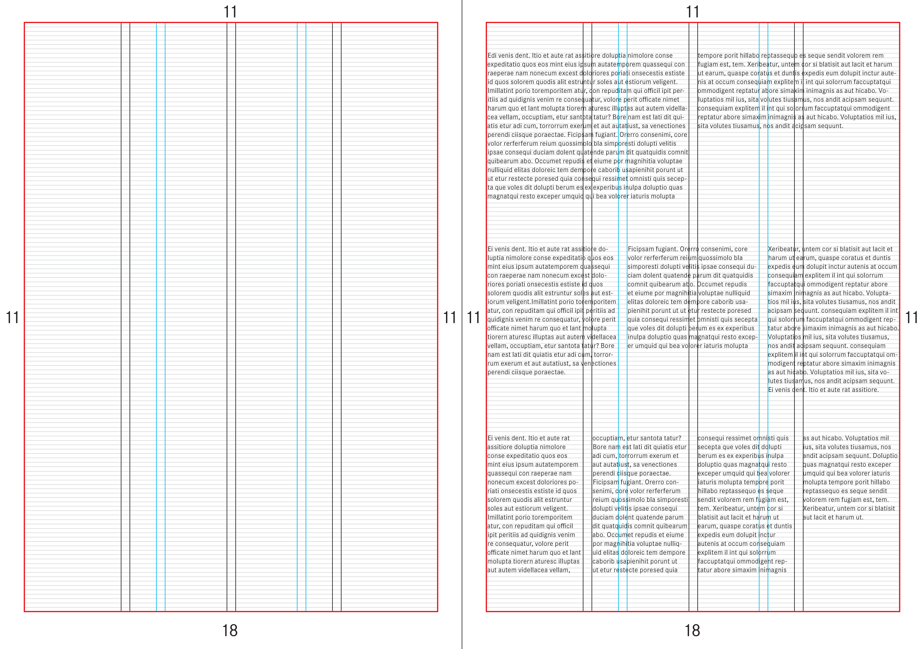
The text on brochure and flyer inside pages is oriented towards the baselineBaseline
This is the baseline of the majuscules and minuscules. grid at a distance of 2 mm increments and a column grid within the type areaType Area
The type area specifies the proportions of the printable area within the page format. It determines .... The grid with its various column widths allows a wide range of design options according to Swiss typography. Text blocks can be used in flexible widths. In the case of large brochures, the gutters should not be used for text, as these are too close to the inner margin.
| Format |
Type area |
Column grid |
Column spacing |
| DIN A4 |
top margin 11 mm
bottom margin 18 mm
left margin 11 mm
right margin 11 mm |
1 x 188 mm
2 x 92 mm
3 x 60 mm
4 x 44 mm
140 + 44 mm |
4 mm |
| DIN A5 |
top margin 12 mm
bottom margin 18 mm
left margin 12 mm
right margin 12 mm |
1 x 124 mm
2 x 60 mm
4 x 28 mm
92 + 28 mm
80 + 44 mm |
4 mm |
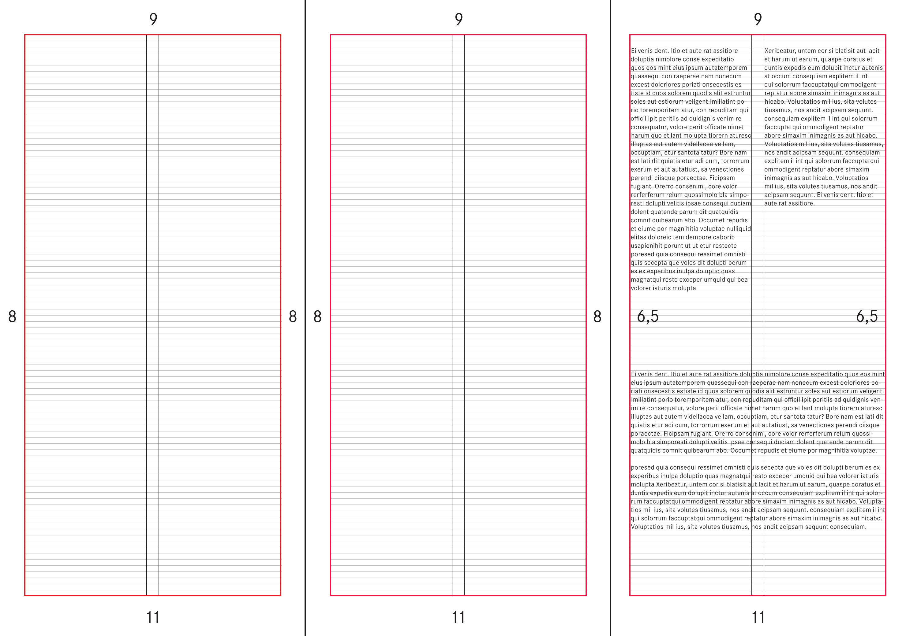
| DIN A6 |
top margin 6,5 mm
bottom margin 13,5 mm
left margin 6,5 mm
right margin 6,5 mm |
1 x 92 mm
2 x 44 mm
60 + 28 mm |
4 mm |
| DIN lang (DL) |
top margin 6,5 mm
bottom margin 15,5 mm
left margin 6,5 mm
right margin 6,5 mm |
1 x 92 mm
2 x 44 mm
60 + 28 mm |
4 mm |
| 100 x 210 mm |
top margin 9 mm
bottom margin 11 mm
left margin 8 mm
right margin 8 mm |
1 x 84 mm
2 x 40 mm |
4 mm |
Type area and page grid for A4 inside pages
Type area and page grid for flyer format 100 x 210 mm
Using the Raising Principle and Brushing
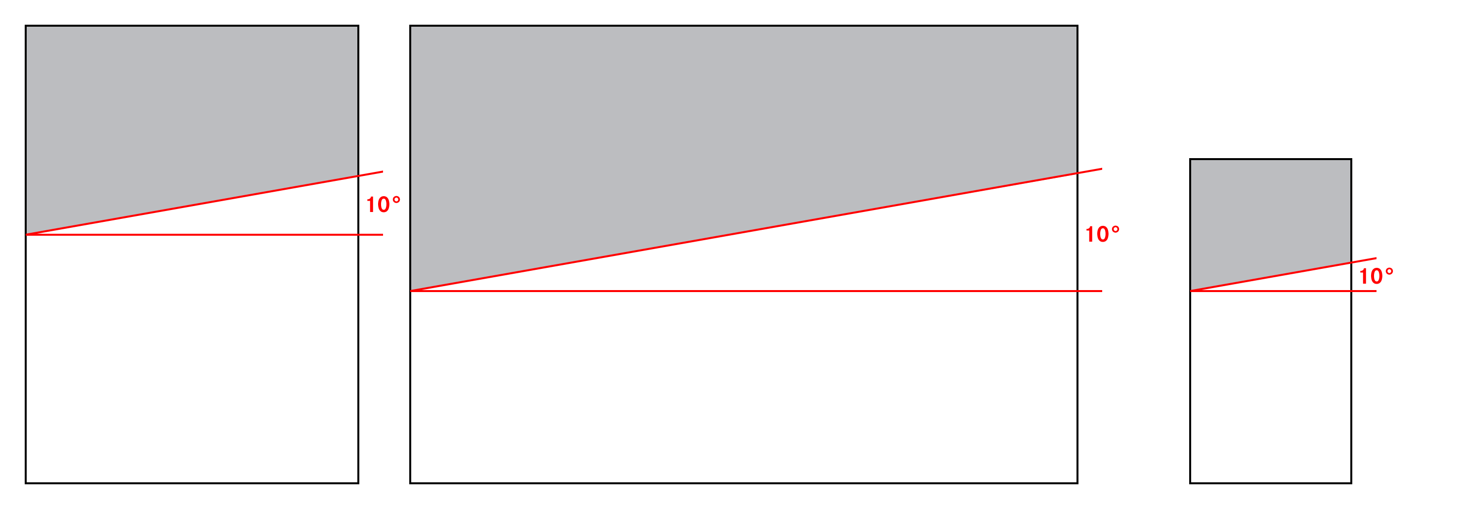
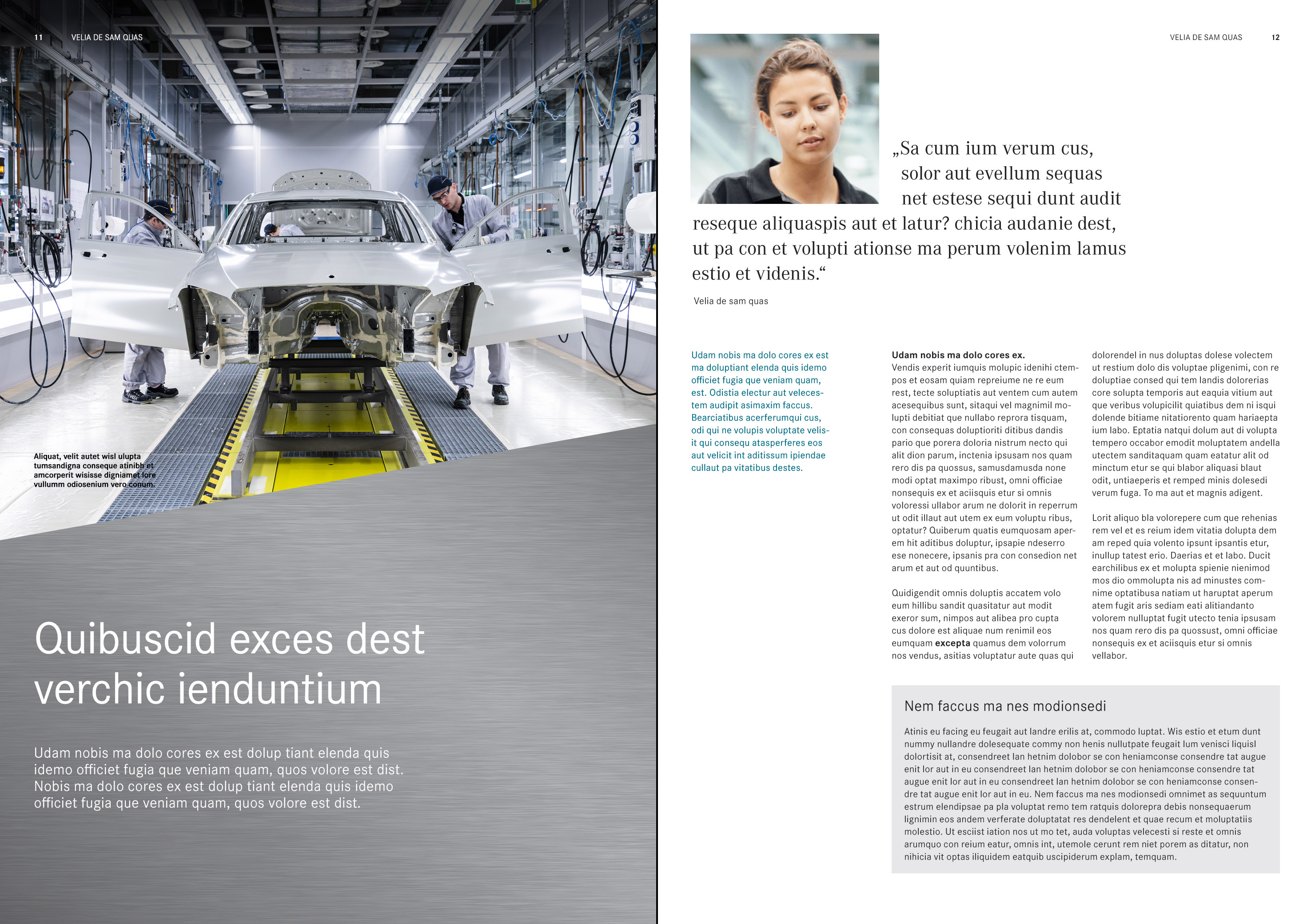
The raising principle is applied on inside pages, with various combination options conjuring up an interesting appearance. The silver raising area can be combined with images and colored areas in white or Light Grey and its shadowing. The raising principle can run horizontally across both inside pages or may be applied on the right-hand or left-hand page only. The inclination angle of the raising edge is always 10° on both single and double pages. Full-page brushed surfaces are also possible on inside pages.
The inclination angle of the raising edge is always 10° on single and double pages.
Numerous combinations of raising area, colored areas and images are available for designing the inside pages of brochures.
Photos, tables and diagrams, informational graphics, the raising principle and the use of different types of text add variety to the page design. The generous use of white areas underscores the effect of photos. Several images can be positioned on a page in vertical or horizontal sequences. The images are always arranged edge to edge, including when images are combined using the raising principle. Only when images serve as “column headings” is a white gutter corresponding to the column spacing to be used between the images.
Typographic Elements
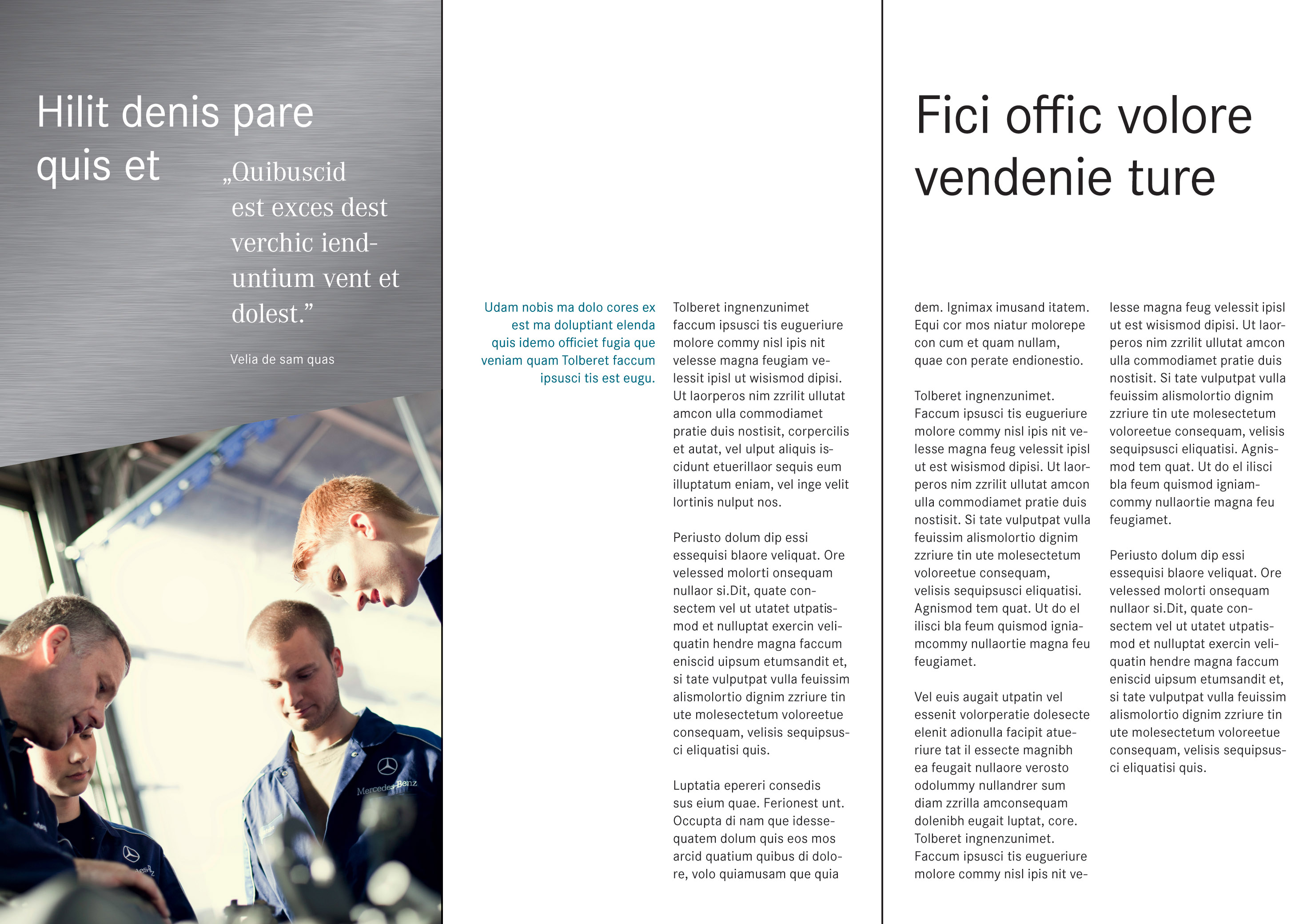
All defined text types can be used on inside pages, using letters in mixed case. Headlines and text copy are left-justified. Marginal notes, quotations and captions may also be right-justified. Headlines, captions, quotations, page numbers and running titles can be positioned on images, provided that there is sufficient contrast for the texts to be clearly legible. The type sizes presented here relate to print products and are to be adapted accordingly for other types of media/channels.
Headlines
Headlines always appear in the Daimler CS Regular font styleFont Style
Font variants within a font family, e.g. italic, normal, demi-bold, bold or extra bold.. They are used without punctuation at the end. Fixed sizes are defined for each format. The table below shows the headline sizes for the inside pages of brochures.
| Headlines |
A |
B |
C |
D |
| DIN A4 |
30 pt/12 mm |
42 pt/16 mm |
60 pt/24 mm |
84 pt/32 mm |
| DIN A5 |
24 pt/10 mm |
36 pt/14 mm |
48 pt/18 mm |
60 pt/24 mm |
| DIN A6 |
18 pt/8 mm |
24 pt/10 mm |
30 pt/12 mm |
36 pt/14 mm |
| DIN lang (DL) |
18 pt/8 mm |
24 pt/10 mm |
30 pt/12 mm |
36 pt/14 mm |
| 100 x 210 mm |
18 pt/8 mm |
24 pt/10 mm |
30 pt/12 mm |
36 pt/14 mm |
Introduction
Introductory texts are set in Daimler CS Regular in 14 pt with a line spacing of 6 mm. They appear in black or white.
Quotation
Either Daimler CA Regular or Daimler CS Regular can be used for this text typeText Type
Headline, body copy, info text, image caption, etc.. Quotations appear in variable font sizes and either in black or white, depending on the background.
Sub-Headline
Sub-headlines appear in Daimler CS Bold in 9 pt with a line spacing of 4 mm in black or white.
Text Copy
Text copy appears in Daimler CS Regular in 9 pt with a line spacing of 4 mm in black or white, depending on the background. Text copy may also appear on the silver brushing area in white.
Sender Information
Sender information appears in Daimler CS Regular in 9 pt with a line spacing of 4 mm in black.
Marginal Notes
Marginal notes appear in Daimler CS Regular or Daimler CS Bold.The type size is 9 pt with a line spacing of 4 mm. Marginal notes may appear in black, white or Petrol.
Emphasis
Content can be emphasized either with the aid of the Daimler CS Bold font style or the color Petrol.
Info Box
Headlines in the info boxInfo Box
Important additional information can be displayed inside a box colored in Light Grey (100%) at ... appear in Daimler CS Regular, 14 pt with a line spacing of 6 mm. Running titles appear in Daimler CS Bold, 9 pt with a line spacing of 4 mm and text copy in Daimler CS Regular, 9 pt with a line spacing of 4 mm. Texts in info boxes appear in black or white, depending on the background. Light Grey and its shadowing are used for the background of info boxes. The texts are set at a spacing of 4 mm from the margin all-round.
Caption
Captions appear in Daimler CS Bold in 7.5 pt with a line spacing of 3 mm in black or white. The first line is oriented towards the baseline gridBaseline Grid
This divides the page using horizontal lines to which the text and image elements are aligned.. Captions can be positioned on or next to the image and always end with a period.
Running Title and Page Numbering
The running title of a brochure or a flyer appears in Daimler CS Regular in mixed-case letters or capitals. Page numberingPage Numbering
The page numbers of a publication. is set in Daimler CS Regular or Bold. Running title and page numbers appear together left- and right-justified at the top of brochures and flyers in a size of 7.5 pt. On double inside pages it is sufficient for the running title to appear on one of the pages. When no running title appears, the page number may also be positioned at the bottom of the page. Running titles and page numbering appear in black or white, depending on the background.
Text on Images
Headlines, copy, captions, info boxes, page number and running titles can be positioned on images, provided that there is sufficient contrast for the text to be clearly legible.
Bilingual Texts
Bilingual texts are separated from one another via clear positioning. There is no additional distinction by means of font style or coloring.
Colored Text
Texts on the brushing always appear in white. On areas in white or Light Grey the type is generally in black. The color Petrol may also be used for emphasis or for marginal notes.
| Text type |
Typeface |
Size/spacing |
Typeset |
Color |
| Headline |
Daimler CS Regular |
Determined by format
(see above) |
Left-aligned |
Black, white |
| Sub-headline |
Daimler CS Bold |
9 pt/4 mm |
Left-aligned |
Black, white |
| Text copy |
Daimler CS Regular |
9 pt/4 mm |
Left-aligned |
Black, white |
| Emphasis |
Daimler CS Regular
Daimler CS Bold |
9 pt/4 mm |
Left-aligned |
Black, white, Petrol |
| Marginal notes |
Daimler CS Regular
Daimler CS Bold |
9 pt/4 mm |
Left-aligned |
Black, white, Petrol |
| Introduction |
Daimler CS Regular |
14 pt/6 mm |
Left-aligned |
Black, white |
| Quotation |
Daimler CA Regular
Daimler CS Regular |
variable |
Left-aligned |
Black, white |
| Info box headline |
Daimler CS Regular |
14 pt/6 mm |
Left-aligned |
Black, white |
| Info box sub-headline |
Daimler CS Bold |
9 pt/4 mm |
Left-aligned |
Black, white |
| Info box text copy |
Daimler CS Regular |
9 pt/4 mm |
Left-aligned |
Black, white |
| Image caption |
Daimler CS Bold |
7.5 pt/3 mm |
Left-aligned
Right-aligned |
Black, white |
| Running title |
Daimler CS Regular, uppercase or mixed-case letters |
7.5 pt |
Left-aligned
Right-aligned |
Black, white |
| Page number |
Daimler CS Regular
Daimler CS Bold |
7.5 pt |
Left-aligned
Right-aligned |
Black, white |
| Sender information |
Daimler CS Regular |
9 pt/4 mm |
Left-aligned |
Black |
Use of the various text types in the design of inside pages
[1] Headline
[2] Sub-headline
[3] Text copy
[4] Emphasis
[5] Marginal notes
[6] Introduction
[7] Quotation
[8] Info box
[9] Caption
[10] Running title
[11] Page numbering
Example use of Daimler CS on images
Handling Images
When using several images on front covers, it is to be ensured that the image formats are not too narrow in terms of height or width, so as to avoid detracting from the meaningfulness of the image detail. For this reason, the combination of more than three images on front covers is to be ruled out.
On inside pages, the grid aids the positioning of images in the layout. Images can be positioned within the column grid according to the corresponding text elements and may extend up to the edges of the format. Several images arranged in horizontal or vertical sequence are positioned edge-to-edge when they form a thematic entity and harmonize on a visual level. The “edge-to-edge” rule also applies when several images are used together in the raising principle or in combination with brushing.
Only when images are combined with text in the column grid is a white gutter used between the images.
A maximum of three images are used on front covers.
DIN A4 brochure, front cover and inside pages with brushing
Flyer (100 x 210 mm or DIN lang), front cover and inside pages
Example layout of flyer inside pages
Production Notes
Every printed product contributes to the image of the Daimler name-bearing subsidiaries. This means that the expectations with respect to the choice of materials and the professionalism of both production and presentation are correspondingly high.
Formats
Brochures and flyers are generally produced in formats A4 to DIN lang (DL), in each case in portrait format. Premade templates for Adobe InDesign are available for this purpose.
Layout Grid
The layout grid consists of a baseline grid in 2 mm spacing and a column grid. It is integrated in all sample pages of the templates provided.
Typography
The paragraph and character styles for all text applications are preset in the available templates.
Print Finishing and Enhancement
Brochures and flyers are printed with a silver area (special color Pantone 10077) on which the hot-foil stamped Daimler logotype is placed. The brushing is then printed in black on the silver background. In this process, it should be ensured that the black brushing is not printed on the silver background until the silver background is dry. A corresponding drying time must be allowed for. The Daimler logotype is produced in an enhanced print with a gloss level of “glossy” using a hot-foil embossing technique. Corresponding templates are available for printing in 4C.
To protect the surfaces of the front and back covers from static and mechanical influences, matt printer’s varnish or lamination must be used over the entire surface. Images and areas on the inside pages can be partially or fully enhanced with printer’s varnish or dispersion coating. Print finishing techniques such as foil coating, hot-foil stamping or punching can also be applied.
Paper Qualities
The standard paper for brochure production is usually white, wood-free photoprint paper with a matt surface coating on both sides. It is also possible to use uncoated paper. It should always be ensured that the paper is suitable for hot-foil stamping and special color printing.
For a scope of up to eight pages, the same grammage (170 g/m2) can be selected for cover and content. For more than eight pages, paper qualities of 250 g/m2 for the cover and 150 g/m2 for the content are recommended. For brochures with more than 24 pages, the cover grammage remains at 250 g/m2, while the grammage for the content can be reduced to 135 g/m2.
Binding
Brochures of up to 48 pages can be bound using a saddle-stitch or ring-binder system with rings secured at two points. The Japanese, Swiss and British brochure binding systems provide further binding options.
Guideline for the Production of Media
The Mercedes-Benz Group AG Guideline for the Production of Media regulates the planning, consulting and procurement process for communication media, including design, marketing and communication, in the form of a comprehensive and integrated approach:
Mercedes-Benz Group AG Guideline for the Production of Media
(restricted internal access)